The HTML select element is the classic dropdown most often seen in forms. It allows users to select something from a set of options. Multiple options can be selected but users are most often required to choose one option per select field.
Examples
Syntax
1 | <select name="name" required> |
2 | <option value="1">John</option> |
3 | <option value="2">Jane</option> |
4 | <option value="3">Donald</option> |
5 | <option value="4">Chuck</option> |
6 | <option value="5">Leslie</option> |
7 | </select> |
A select element with the multiple attribute enabled (true) allows for multiple options to submit with a form submission.
1 | <select multiple name="name" required> |
2 | <option value="1">John</option> |
3 | <option value="2">Jane</option> |
4 | <option value="3">Donald</option> |
5 | <option value="4">Chuck</option> |
6 | <option value="5">Leslie</option> |
7 | </select> |
Result
Browser Support
The select element is supported in all modern browsers. Read more on caniuse.com.
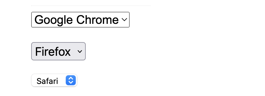
Browsers display select elements differently, depending on their rendering engine. Take a look at this example which shows the same select element in Google Chrome (powered by Blink), Firefox (powered by Quantum), and Safari (powered by WebKit).


Attributes
A select element supports Global Attributes in HTML. Global Attributes are common to all HTML elements and can be used on all of them (though they may not have much of an effect on some of them).
In addition to global attributes the select element has a group of other attributes:
- autocomplete: Hit for a form to autofill.
- disabled: Whether or not the form control is disabled.
- form: Associates the
selectwith aformelement. - multiple: Whether or not to allow multiple values.
name: The name of the element to use for form submissions or via the form.elements API.required: Whether theselectis required for form submission.- size: Size of the
select.
Content
The select element supports zero or more option, optgroup, and script-supporting elements.
If selecting a value is optional, you might want to include an empty <option> at the top of your <select> element.
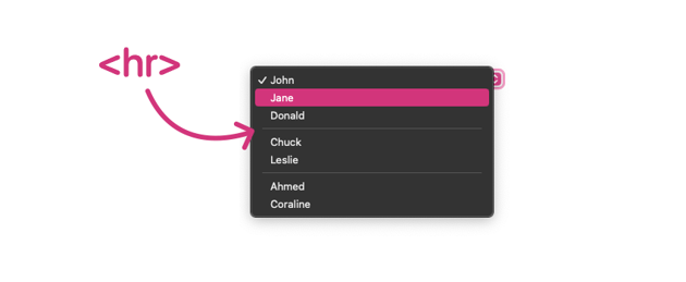
As of Chrome 119 and Safari 17, it’s also possible to include <hr> elements to divide up your <option> elements, like so:
1 | <select> |
2 | <option value="1">John</option> |
3 | <option value="2">Jane</option> |
4 | <option value="3">Donald</option> |
5 | <hr> |
6 | <option value="4">Chuck</option> |
7 | <option value="5">Leslie</option> |
8 | <hr> |
9 | <option value="6">Ahmed</option> |
10 | <option value="7">Coraline</option> |
11 | </select> |


Here’s a live demo, but if you’re unable to see the <hr> elements in your browser, try Safari Technology Preview.
- The
<select>element is usually found within a <form>, though it’s perfectly valid HTML to have a<select>elsewhere. - The
<select>element is very similar to the <datalist> element, as both give users multiple<option>s to select from. However,<datalist>is more a list of suggested options, and users can actually enter their own value.


