Oklab is a new perceptual color space supported in all major browsers created by the Swedish engineer Björn Ottosson. In this interview, Philip Jägenstedt explores how and why Björn created Oklab and how it spread across the ecosystem.
Note: The original interview was conducted in Swedish and is available to watch.
About Björn
Contents
Philip Jägenstedt: Tell me a little about yourself, Björn.
 Björn Ottosson: I worked for many years in the game industry on game engines and games like FIFA, Battlefield, and Need for Speed. I’ve always been interested in technology and its interaction with the arts. I’m an engineer, but I’ve always held both of these interests.
On Working With Color
Philip: For someone who hasn’t dug into colors much, what’s so hard about working with them?
Björn: Intuitively, colors can seem quite simple. A color can be lighter or darker, it can be more blue or more green, and so on. Everyone with typical color vision has a fairly similar experience of color, and this can be modeled.
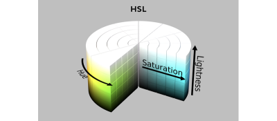
However, the way we manipulate colors in software usually doesn’t align with human perception of colors. The most common color space is sRGB. There’s also HSL, which is common for choosing colors, but it’s also based on sRGB.
One problem with sRGB is that in a gradient between blue and white, it becomes a bit purple in the middle of the transition. That’s because sRGB really isn’t created to mimic how the eye sees colors; rather, it is based on how CRT monitors work. That means it works with certain frequencies of red, green, and blue, and also the non-linear coding called gamma. It’s a miracle it works as well as it does, but it’s not connected to color perception. When using those tools, you sometimes get surprising results, like purple in the gradient.


On Color Perception
Philip: How do humans perceive color?
Björn: When light enters the eye and hits the retina, it’s processed in many layers of neurons and creates a mental impression. It’s unlikely that the process would be simple and linear, and it’s not. But incredibly enough, most people still perceive colors similarly.
People have been trying to understand colors and have created color wheels and similar visualizations for hundreds of years. During the 20th century, a lot of research and modeling went into color vision. For example, the CIE XYZ model is based on how sensitive our photoreceptor cells are to different frequencies of light. CIE XYZ is still a foundational color space on which all other color spaces are based.
There were also attempts to create simple models matching human perception based on XYZ, but as it turned out, it’s not possible to model all color vision that way. Perception of color is incredibly complex and depends, among other things, on whether it is dark or light in the room and the background color it is against. When you look at a photograph, it also depends on what you think the color of the light source is. The dress is a typical example of color vision being very context-dependent. It is almost impossible to model this perfectly.
Models that try to take all of this complexity into account are called color appearance models. Although they have many applications, they’re not that useful if you don’t know if the viewer is in a light or bright room or other viewing conditions.
The odd thing is that there’s a gap between the tools we typically use — such as sRGB and HSL — and the findings of this much older research. To an extent, this makes sense because when HSL was developed in the 1970s, we didn’t have much computing power, so it’s a fairly simple translation of RGB. However, not much has changed since then.
We have a lot more processing power now, but we’ve settled for fairly simple tools for handling colors in software.
Display technology has also improved. Many displays now have different RGB primaries, i.e., a redder red, greener green, or bluer blue. sRGB cannot reach all colors available on these displays. The new P3 color space can, but it’s very similar to sRGB, just a little wider.
On Creating Oklab
Philip: What, then, is Oklab, and how did you create it?
Björn: When working in the game industry, sometimes I wanted to do simple color manipulations like making a color darker or changing the hue. I researched existing color spaces and how good they are at these simple tasks and concluded that all of them are problematic in some way.
Many people know about CIE Lab. It’s quite close to human perception of color, but the handling of hue is not great. For example, a gradient between blue and white turns out purple in CIE Lab, similar to in sRGB. Some color spaces handle hue well but have other issues to consider.
When I left my job in gaming to pursue education and consulting, I had a bit of time to tackle this problem. Oklab is my attempt to find a better balance, something Lab-like but “okay”.
I based Oklab on two other color spaces, CIECAM16 and IPT. I used the lightness and saturation prediction from CIECAM16, which is a color appearance model, as a target. I actually wanted to use the datasets used to create CIECAM16, but I couldn’t find them.
IPT was designed to have better hue uniformity. In experiments, they asked people to match light and dark colors, saturated and unsaturated colors, which resulted in a dataset for which colors, subjectively, have the same hue. IPT has a few other issues but is the basis for hue in Oklab.
Using these three datasets, I set out to create a simple color space that would be “okay”. I used an approach quite similar to IPT but combined it with the lightness and saturation estimates from CIECAM16. The resulting Oklab still has good hue uniformity but also handles lightness and saturation well.
Philip: How about the name Oklab? Why is it just okay?
Björn: This is a bit tongue-in-cheek and some amount of humility.
For the tasks I had in mind, existing color spaces weren’t okay, and my goal was to make one that is. At the same time, it is possible to delve deeper. If a university had worked on this, they could have run studies with many participants. For a color space intended mainly for use on computer and phone screens, you could run studies in typical environments where they are used. It’s possible to go deeper.
Nevertheless, I took the datasets I could find and made the best of what I had. The objective was to make a very simple model that’s okay to use. And I think it is okay, and I couldn’t come up with anything better. I didn’t want to call it Björn Ottosson Lab or something like that, so I went with Oklab.
Philip: Does the name follow a tradition of calling things okay? I know there’s also a Quite OK Image format.
Björn: No, I didn’t follow any tradition here. Oklab was just the name I came up with.
On Oklab Adoption
Philip: I discovered Oklab when it suddenly appeared in all browsers. Things often move slowly on the web, but in this case, things moved very quickly. How did it happen?
Björn: I was surprised, too! I wrote a blog post and shared it on Twitter.
I have a lot of contacts in the gaming industry and some contacts in the Visual Effects (VFX) industry. I expected that people working with shaders or visual effects might try this out, and maybe it would be used in some games, perhaps as an effect for a smooth color transition.
But the blog post was spread much more widely than I thought. It was on Hacker News, and many people read it.
The code for Oklab is only 10 lines long, so many open-source libraries have adopted it. This all happened very quickly.
Chris Lilley from the W3C got in touch and asked me some questions about Oklab. We discussed it a bit, and I explained how it works and why I created it. He gave a presentation at a conference about it, and then he pushed for it to be added to CSS.
Photoshop also changed its gradients to use Oklab. All of this happened organically without me having to cheer it on.
Philip: In another blog post, you introduced two other color spaces, Okhsv and Okhsl. You’ve already talked about HSL, so what is Okhsl?
Björn: When picking colors, HSL has a big advantage, which is that the parameter space is simple. Any value 0-360 for hue (H) together with any values 0-1 for saturation (S) and lightness (L) are valid combinations and result in different colors on screen. The geometry of HSL is a cylinder, and there’s no way to end up outside that cylinder accidentally.

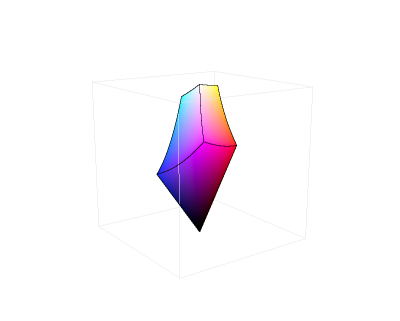
By contrast, Oklab contains all physically possible colors, but there are combinations of values that don’t work where you reach colors that don’t exist. For example, starting from light and saturated yellow in Oklab and rotating the hue to blue, that blue color does not exist in sRGB; there are only darker and less saturated blues. That’s because sRGB in Oklab has a strange shape, so it’s easy to end up going outside it. This makes it difficult to select and manipulate colors with Oklab or Oklch.

Okhsl was an attempt at compromise. It maintains Oklab’s behavior for colors that are not very saturated, close to gray, and beyond that, stretches out to a cylinder that contains all of sRGB. Another way to put it is that the strange shape of sRGB in Oklab has been stretched into a cylinder with reasonably smooth transitions.
The result is similar to HSL, where all parameters can be changed independently without ending up outside sRGB. It also makes Okhsl more complicated than Oklab. There are unavoidable compromises to get something with the characteristics that HSL has.
Everything with color is about compromises. Color vision is so complex that it’s about making practical compromises.
This is an area where I wish there were more research. If I have a white background and want to pick some nice colors to put on it, then you can make a lot of assumptions. Okhsl solves many things, but is it possible to do even better?
On Color Compromises
Philip: Some people who have tried Oklab say there are too many dark shades. You changed that in Okhsl with a new lightness estimate.
Björn: This is because Oklab is exposure invariant and doesn’t account for viewing conditions, such as the background color. On the web, there’s usually a white background, which makes it harder to see the difference between black and other dark colors. But if you look at the same gradient on a black background, the difference is more apparent.
CIE Lab handles this, and I tried to handle it in Okhsl, too. So, gradients in Okhsl look better on a white background, but there will be other issues on a black background. It’s always a compromise.
And, Finally…
Philip: Final question: What’s your favorite color?
Björn: I would have to say Burgundy. Burgundy, dark greens, and navy blues are favorites.
Philip: Thank you for your time, Björn. I hope our readers have learned something, and I’ll remind them of your excellent blog, where you go into more depth about Oklab and Okhsl.
Björn: Thank you!
(gg, yk)

