Ever wonder why companies like Apple or Amazon have such a cult following or why people love to use their sites as “inspiration” for their own website designs? I was one of these people back in my early days as a web designer. The first thing I’d do before starting a design project is look at these brands and try to emulate their look and feel. I made sure my designs were as clean and beautiful as theirs, and ensured that they were usable. However, it didn’t take me long to find that I didn’t quite get the same results. The difference was that I didn’t tailor my site for my own unique users. To get the results I was looking for, I needed to know how to improve the overall user experience (UX) for MY target audience.
What is UX anyway?
The key is to get them from point A to point B while also providing an enjoyable experience.
I hear people all the time using the words UI, usability, and UX interchangeably. While a good UI (user interface) and usability are important aspects of user experience, actual UX encompasses how a visitor or user perceives, interacts with, and experiences your product or service. Think about UI like a store’s layout and decor, but UX as the overall shopping experience.
Get to know your customer
There are things you might know right off the bat about your customers, but you’re only touching the surface until you uncover how your users are interacting with your website, what their frustrations are, and what motivates their decisions. And the best place to get this info — is directly from them!
Research does a website good
There are countless ways to conduct UX research and you might use different methods depending on the project. I usually start with gathering existing data. From there, I begin conducting user interviews, surveys, and user testing until I finally get to a place where I can start developing personas and creating a comprehensive mental model.
The goal of this process is to use the information gathered to provide solutions to users’ problems and address their needs while keeping them delighted and engaged. The key is to get them from point A to point B while also providing an enjoyable experience. Think about why you might be loyal to some brands and not others.
The holy grail of UX design: mental models

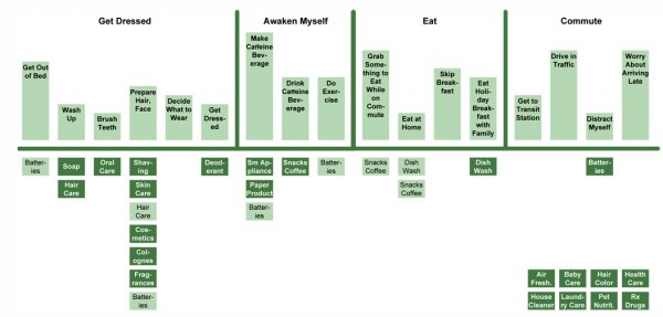
From my experience, a mental model is the most useful tool for designing an original site that delivers results. A mental model illustrates how a person will likely apply past experience to a brand new situation.
Just to give you an idea of what our mental model diagram looked like when redesigning cpanel.com, the top half consisted of boxes that listed all of the user stories, behaviors, motivations, and frustrations that we discovered as part of our research. The bottom half provided the ways in which we planned to support or solve what was listed above. With this simple and easy-to-create diagram, we were able to come up with features and design solutions for the website without having to guess. To top it off, it didn’t take us several months to complete.
Experiment
While getting to know your users is essential to the success of your site’s design, the truth is that you’ll have to do some testing, measuring, and iterating before you get your site to its optimum performance. To help you get started, I’ve provided some handy links with information about UX research, mental models, and other UX tools so you can uncover the secret ingredient that will keep your users coming back for more.
Download our Free Mental Model Diagram
Let us know what worked for your organization in the comments.

