Every generation is different in very unique ways, with different habits, views, standards, and expectations. So when designing for Gen Z, what do we need to keep in mind? Let’s take a closer look at Gen Z, how they use tech, and why it might be a good idea to ignore common design advice and do the opposite of what is usually recommended instead.
This article is part of our ongoing series on UX. You can find more details on design patterns and UX strategy in Smart Interface Design Patterns 🍣 — with live UX training coming up soon. Free preview.
Gen Z: Most Diverse And Most Inclusive
Contents
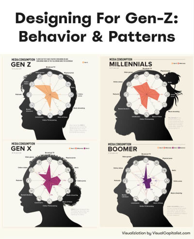
When we talk about Generation Z, we usually refer to people born between 1995 and 2010. Of course making universal statements about a cohort where some are adults in their late 20s and others are school students is at best ineffective and at worst wrong — yet there are some attributes that stand out compared to earlier generations.
Gen Z is the most diverse generation in terms of race, ethnicity, and identity. Research shows that young people today are caring and proactive, and far from being “slow, passive and mindless” as they are often described. In fact, they are willing to take a stand and break their habits if they deeply believe in a specific purpose and goal. Surely there are many distractions along that way, but the belief in fairness and sense of purpose has enormous value.
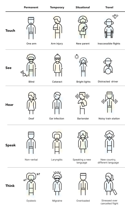
Their values reflect that: accessibility, inclusivity, sustainability, and work/life balance are top priorities for Gen Zs, and they value experiences, principles, and social stand over possessions.
What Gen Z Deeply Cares About
Gen Z grew up with technology, so unsurprisingly digital experiences are very familiar and understood by them. On the other hand, digital experiences are often suboptimal at best — slow, inaccessible, confusing, and frustrating. Plus, the web is filled with exaggerations and generic but fluffy statements. So it’s not a big revelation that Gen Zs are highly skeptical of brands and advertising by default (rightfully so!), and rely almost exclusively on social circles, influencers, and peers as main research channels.
They might sometimes struggle to spot what’s real and what’s not, but they are highly selective about their sources. They are always connected and used to following events live as they unfold, so unsurprisingly, Gen Z tends to have little patience.
And sure enough, Gen Z loves short-form content, but that doesn’t necessarily equate to a short attention span. Attention span is context-dependent, as documentaries and literature are among Gen Z’s favorites.
Designing For Gen Z
Most design advice on Gen Z focuses on producing “short form, snackable, bite-sized” content. That content is optimized for very short attention spans, TikTok-alike content consumption, and simplified to the core messaging. I would strongly encourage us to do the opposite.
We shouldn’t discount Gen Z as a generation with poor attention spans and urgent needs for instant gratification. Gen Zs have very strong beliefs and values, but they are also inherently curious and want to reshape the world. We can tell a damn good story. Captivate and engage. Make people think. Many Gen Zs are highly ambitious and motivated, and they want to be challenged and to succeed. So let’s support that. And to do that, we need to remain genuine and authentic.
Remain Genuine And Authentic
As Michelle Winchester noted, Gen Zs have very diverse perspectives and opinions, and they possess a discerning ability to detect disingenuous content. That’s also where mistrust towards AI comes into play, along with AI fatigue. As Nilay Patel mentioned on Ezra Klein Show, today when somebody says that something is “AI-generated”, usually it’s not a praise, but rather a testament how poor and untrustworthy it actually is.
Gen Z expects better. Hence brands that value sincerity, honesty, and authenticity are perceived as more trustworthy compared to brands that don’t have an opinion, don’t take a stand, don’t act for their beliefs and principles. For example, the “Keep Beauty Real” campaign by Dove (shown below) showcases the value of genuine human beauty, which is so often missed and so often exaggerated to extremes by AI.
So whenever you can, aim for the opposite of perfect. Say what you think and do what you promise. Reflect the real world with real people using real products, however imperfect they are. That’s how you build a strong relationship and trust with Gen Z.
Accessibility First
Because Gen Z are so incredibly diverse, their needs are extremely diverse and demanding as well. This doesn’t necessarily mean customization of features or adapting the layout entirely based on custom settings or preferences. But it does mean providing an accessible experience out of the box.
Simple things matter. High enough color contrast. Links that look like links. Buttons that look like buttons. Forms that are broken down into simple steps to follow. Diverse gender and identity options. Proper tab order. Keyboard accessibility. Reduced motion for people who opt in for reduced motion sickness. Dark mode and light mode.
It’s nothing groundbreaking really. Just basic things that help focus and get things done. In fact, accessibility is better for everyone — not just for Gen Z (who expect and demand it) but also for absolutely everybody around the world.
Mobile-Only, Not Mobile First
Many design mock-ups that we are creating today are typically designed and presented on large screens first. However, depending on your user base, a vast majority of users (and that’s especially true for Gen Zs), will use almost exclusively mobile devices to access your products and services. This surely will be different for enterprise software, but consumer products are much less likely to be used on desktop devices by younger Gen Zs.
Get into the habit of presenting your design mock-ups in mobile views only first. Help people read better. Content design has never been more important — especially when designing for mobile screens. Here are a few guidelines to keep in mind:
- Avoid long walls of text → max. 50 words per paragraph.
- Avoid long sentences → max. 20 words per sentence.
- Write for mobile first: brief, clear, and concise.
- Include a plain language summary, even for legal docs.
- Use Inverted Pyramid: key insights first, details below.
- Nothing is more effective than removing waste and fluff.
Many people, and especially Gen Z, turn on closed captioning by default these days. Perhaps the spoken language isn’t their native language, or perhaps they aren’t quite familiar with the accent of some speakers, or maybe they don’t have headphones nearby, don’t want to use them, or can’t use them. In short, closed captions are better for everybody and they increase ROI and audience.
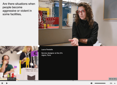
Gareth Ford Williams has put together a visual language of closed captions and has kindly provided a PDF cheatsheet that is commonly used by professional captioners. There are some generally established rules about captioning, and here are some that I found quite useful when working on captioning for my own video course:
- Divide your sentences into two relatively equal parts like a pyramid (40ch per line for the top line, a bit less for the bottom line);
- Always keep an average of 20 to 30 characters per second;
- A sequence should only last between 1 and 8 seconds;
- Always keep a person’s name or title together;
- Do not break a line after conjunction;
- Consider aligning multi-lined captions to the left.
On YouTube, users can select a font used for subtitles and choose between monospaced and proportional serif and sans-serif, casual, cursive, and small-caps. But perhaps, in addition to stylistic details, we could provide a careful selection of fonts to help audiences with different needs. This could include a dyslexic font or a hyper-legible font, for example.
Additionally, we could display presets for various high contrast options for subtitles. This gives users a faster selection, requiring less effort to configure just the right combination of colors and transparency. Still, it would be useful to provide more sophisticated options just in case users need them.
Support Intrinsic Motivation
On the other hand, in times of instant gratification with likes, reposts, and leaderboards, people often learn that a feeling of achievement comes from extrinsic signals, like reach or attention from other people. The more important it is to support intrinsic motivation.
As Paula Gomes noted, intrinsic motivation is characterized by engaging in behaviors just for their own sake. People do something because they enjoy it. It is when they care deeply for an activity and enjoy it without needing any external rewards or pressure to do it.
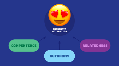
Typically this requires 3 components:
- Competence involves the need to feel capable of achieving a desired outcome.
- Autonomy is about the need to feel in control of your own actions, behaviors, and goals.
- Relatedness reflects the need to feel a sense of belonging and attachment to other people.
In practical terms, that means setting people up for success. Preparing the knowledge and documents and skills they need ahead of time. Building knowledge up without necessarily rewarding them with points. It also means allowing people to have a strong sense of ownership of the decisions and the work they are doing. And adding collaborative goals that would require cooperation with team members and colleagues.
Encourage Critical Thinking
The younger people are, the more difficult it is to distinguish between what’s real and what isn’t. Whenever possible, show sources or at least explain where to find specific details that back up claims that you are making. Encourage people to make up their mind, and design content to support that — with scientific papers, trustworthy reviews, vetted feedback, and diverse opinions.
And: you don’t have to shy away from technical details. Don’t make them mandatory to read and understand, but make them accessible and available in case readers or viewers are interested.
In times where there is so much fake, exaggerated, dishonest, and AI-generated content, it might be just enough to be perceived as authentic, trustworthy, and attention-worthy by the highly selective and very demanding Gen Z.
Good Design Is For Everyone
I keep repeating myself like a broken record, but better accessibility is better for everyone. As you hopefully have noticed, many attributes and expectations that we see in Gen Z are beneficial for all other generations, too. It’s just good, honest, authentic design. And that’s the very heart of good UX.
What I haven’t mentioned is that Gen Z genuinely appreciates feedback and values platforms that listen to their opinions and make changes based on their feedback. So the best thing we can do, as designers, is to actively involve Gen Z in the design process. Designing with them, rather than designing for them.
And, most importantly: with Gen Z, perhaps for the first time ever, inclusion and accessibility is becoming a default expectation for all digital products. With it comes the sense of fairness, diversity, and respect. And, personally, I strongly believe that it’s a great thing — and a testament how remarkable Gen Zs actually are.
Wrapping Up
- Large parts of Gen Z aren’t mobile-first, but mobile-only.
- To some, the main search engine is YouTube, not Google.
- Some don’t know and have never heard of Internet Explorer.
- Trust only verified customer reviews, influencers, friends.
- Used to follow events live as they unfold → little patience.
- Sustainability, reuse, work/life balance are top priorities.
- Prefer social login as the fastest authentication method.
- Typically ignore or close cookie banners, without consent.
- Rely on social proof, honest reviews/photos, authenticity.
- Most likely generation to provide a referral to a product.
- Typically turn on subtitles for videos by default.
Useful Resources
New: How To Measure UX And Design Impact
I’ve just launched “How To Measure UX and Design Impact” 🚀 (8h), a new practical guide for UX leads to measure UX impact on business. Use the code 🎟 IMPACT to save 20% off today. And thank you for your kind and ongoing support, everyone! Jump to details.

(cm, il)
