Few technological innovations can completely change the way we interact with computers. Lucky for us, it seems we’ve won front-row seats to the unfolding of the next paradigm shift.
These shifts tend to unlock a new abstraction layer to hide the working details of a subsystem. Generalizing details allows our complex systems to appear simpler & more intuitive. This streamlines coding programs for computers as well as designing the interfaces to interact with them.
The Command Line Interface, for instance, created an abstraction layer to enable interaction through a stored program. This hid the subsystem details once exposed in earlier computers that were only programmable by inputting 1s & 0s through switches.
Graphical User Interfaces (GUI) further abstracted this notion by allowing us to manipulate computers through visual metaphors. These abstractions made computers accessible to a mainstream of non-technical users.
Despite these advances, we still haven’t found a perfectly intuitive interface — the troves of support articles across the web make that evident. Yet recent advances in AI have convinced many technologists that the next evolutionary cycle of computing is upon us.
The Next Layer Of Interface Abstraction
Contents
A branch of machine learning called generative AI drives the bulk of recent innovation. It leverages pattern recognition in datasets to establish probabilistic distributions that enable novel constructions of text, media, & code. Bill Gates believes it’s “the most important advance in technology since the graphical user interface” because it can make controlling computers even easier. A newfound ability to interpret unstructured data, such as natural language, unlocks new inputs & outputs to enable novel form factors.
Now our universe of information can be instantly invoked through an interface as intuitive as talking to another human. These are the computers we’ve dreamed of in science fiction, akin to systems like Data from Star Trek. Perhaps computers up to this point were only prototypes & we’re now getting to the actual product launch. Imagine if building the internet was laying down the tracks, AIs could be the trains to transport all of our information at breakneck speed & we’re about to see what happens when they barrel into town.
“Soon the pre-AI period will seem as distant as the days when using a computer meant typing at a C:> prompt rather than tapping on a screen.”
— Bill Gates in “The Age of AI Has Begun”
If everything is about to change, so must the mental models of software designers. As Luke Wroblewski once popularized mobile-first design, the next zeitgeist is likely AI-first. Only through understanding AI’s constraints & capabilities can we craft delight. Its influence on the discourse of interface evolution has already begun.
Large Language Models (LLMs), for instance, are a type of AI utilized in many new applications & their text-based nature leads many to believe a conversational interface, such as a chatbot, is a fitting form for the future. The notion that AI is something you talk to has been permeating across the industry for years. Robb Wilson, the co-owner of UX Magazine, calls conversation “the infinitely scalable interface” in his book The Age of Invisible Machines (2022). Noah Levin, Figma’s VP of Product Design, contends that “it’s a very intuitive thing to learn how to talk to something.” Even a herald of GUIs such as Bill Gates posits that “our main way of controlling a computer will no longer be pointing and clicking.”
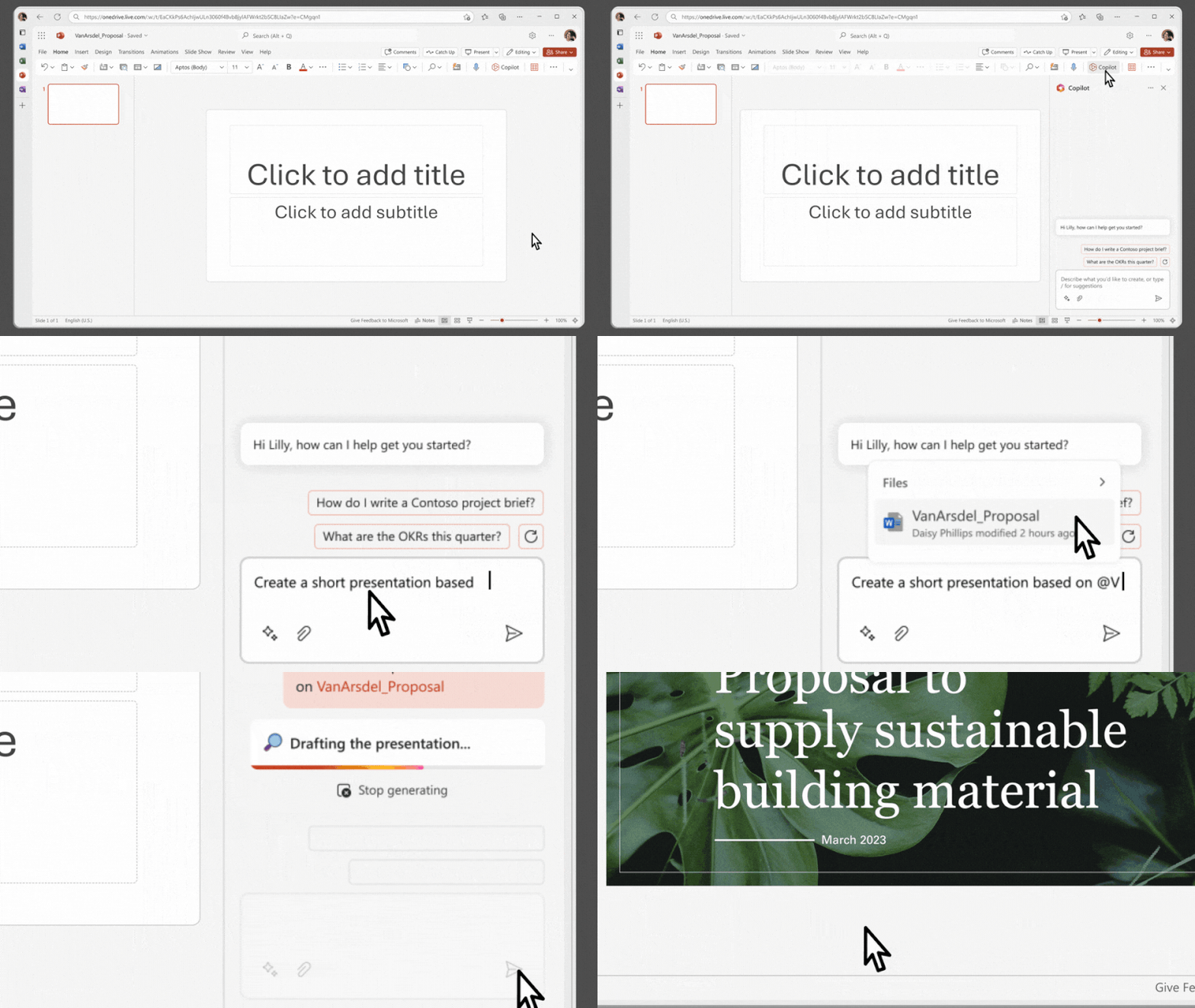
The hope is that conversational computers will flatten learning curves. Jesse Lyu, the founder of Rabbit, asserts that a natural language approach will be “so intuitive that you don’t even need to learn how to use it.”
After all, it’s not as if Data from Stark Trek came with an instruction manual or onboarding tutorial. From this perspective, the evolutionary tale of conversational interfaces superseding GUIs seems logical & echoes the earlier shift away from command lines. But others have opposing opinions, some going as far as Maggie Appleton to call conversational interfaces like chatbots “the lazy solution.”
This might seem like a schism at first, but it’s more so a symptom of a simplistic framing of interface evolution. Command lines are far from extinct; technical users still prefer them for their greater flexibility & efficiency. For use cases like software development or automation scripting, the added abstraction layer in graphical no-code tools can act as a barrier rather than a bridge.
GUIs were revolutionary but not a panacea. Yet there is ample research to suggest conversational interfaces won’t be one, either. For certain interactions, they can decrease usability, increase cost, & introduce security risk relative to GUIs.
So, what is the right interface for artificially intelligent applications? This article aims to inform that design decision by contrasting the capabilities & constraints of conversation as an interface.

Connecting The Pixels
We’ll begin with some historical context, as the key to knowing the future often starts with looking at the past. Conversational interfaces feel new, but we’ve been able to chat with computers for decades.
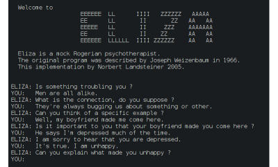
Joseph Weizenbaum invented the first chatbot, ELIZA, during an MIT experiment in 1966. This laid the foundation for the following generations of language models to come, from voice assistants like Alexa to those annoying phone tree menus. Yet the majority of chatbots were seldom put to use beyond basic tasks like setting timers.
It seemed most consumers weren’t that excited to converse with computers after all. But something changed last year. Somehow we went from CNET reporting that “72% of people found chatbots to be a waste of time” to ChatGPT gaining 100 million weekly active users.
What took chatbots from arid to astonishing? Most assign credit to OpenAI’s 2018 invention (PDF) of the Generative Pre-trained Transformer (GPT). These are a new type of LLM with significant improvements in natural language understanding. Yet, at the core of a GPT is the earlier innovation of the transformer architecture introduced in 2017 (PDF). This architecture enabled the parallel processing required to capture long-term context around natural language inputs. Diving deeper, this architecture is only possible thanks to the attention mechanism introduced in 2014 (PDF). This enabled the selective weighing of an input’s different parts.
Through this assemblage of complementary innovations, conversational interfaces now seem to be capable of competing with GUIs on a wider range of tasks. It took a surprisingly similar path to unlock GUIs as a viable alternative to command lines. Of course, it required hardware like a mouse to capture user signals beyond keystrokes & screens of adequate resolution. However, researchers found the missing software ingredient years later with the invention of bitmaps.

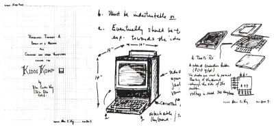
Bitmaps allowed for complex pixel patterns that earlier vector displays struggled with. Ivan Sutherland’s Sketchpad, for instance, was the inaugural GUI but couldn’t support concepts like overlapping windows. IEEE Spectrum’s Of Mice and Menus (1989) details the progress that led to the bitmap’s invention by Alan Kay’s group at Xerox Parc. This new technology enabled the revolutionary WIMP (windows, icons menus, and pointers) paradigm that helped onboard an entire generation to personal computers through intuitive visual metaphors.
Computing no longer required a preconceived set of steps at the outset. It may seem trivial in hindsight, but the presenters were already alluding to an artificially intelligent system during Sketchpad’s MIT demo in 1963. This was an inflection point transforming an elaborate calculating machine into an exploratory tool. Designers could now craft interfaces for experiences where a need to discover eclipsed the need for flexibility & efficiency offered by command lines.

Parallel Paradigms
Novel adjustments to existing technology made each new interface viable for mainstream usage — the cherry on top of a sundae, if you will. In both cases, the foundational systems were already available, but a different data processing decision made the output meaningful enough to attract a mainstream audience beyond technologists.
With bitmaps, GUIs can organize pixels into a grid sequence to create complex skeuomorphic structures. With GPTs, conversational interfaces can organize unstructured datasets to create responses with human-like (or greater) intelligence.
The prototypical interfaces of both paradigms were invented in the 1960s, then saw a massive delta in their development timelines — a case study unto itself. Now we find ourselves at another inflection point: in addition to calculating machines & exploratory tools, computers can act as life-like entities.
But which of our needs call for conversational interfaces over graphical ones? We see a theoretical solution to our need for companionship in the movie Her, where the protagonist falls in love with his digital assistant. But what is the benefit to those of us who are content with our organic relationships? We can look forward to validating the assumption that conversation is a more intuitive interface. It seems plausible because a few core components of the WIMP paradigm have well-documented usability issues.
Nielsen Norman Group reports that cultural differences make universal recognition of icons rare — menus trend towards an unusable mess with the inevitable addition of complexity over time. Conversational interfaces appear more usable because you can just tell the system when you’re confused! But as we’ll see in the next sections, they have their fair share of usability issues as well.
By replacing menus with input fields, we must wonder if we’re trading one set of usability problems for another.
The Cost of Conversation
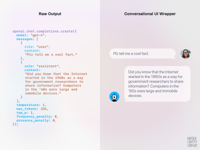
Why are conversational interfaces so popular in science fiction movies? In a Rhizome essay, Martine Syms theorizes that they make “for more cinematic interaction and a leaner production.” This same cost/benefit applies to app development as well. Text completion delivered via written or spoken word is the core capability of an LLM. This makes conversation the simplest package for this capability from a design & engineering perspective.
Linus Lee, a prominent AI Research Engineer, characterizes it as “exposing the algorithm’s raw interface.” Since the interaction pattern & components are already largely defined, there isn’t much more to invent — everything can get thrown into a chat window.
“If you’re an engineer or designer tasked with harnessing the power of these models into a software interface, the easiest and most natural way to “wrap” this capability into a UI would be a conversational interface”
— Linus Lee in Imagining Better Interfaces to Language Models
This is further validated by The Atlantic’s reporting on ChatGPT’s launch as a “low-key research preview.” OpenAI’s hesitance to frame it as a product suggests a lack of confidence in the user experience. The internal expectation was so low that employees’ highest guess on first-week adoption was 100,000 users (90% shy of the actual number).
Conversational interfaces are cheap to build, so they’re a logical starting point, but you get what you pay for. If the interface doesn’t fit the use case, downstream UX debt can outweigh any upfront savings.
Forgotten Usability Principles
Steve Jobs once said, “People don’t know what they want until you show it to them.” Applying this thinking to interfaces echoes a usability evaluation called discoverability. Nielsen Norman Group defines it as a user’s ability to “encounter new content or functionality that they were not aware of.”
A well-designed interface should help users discover what features exist. The interfaces of many popular generative AI applications today revolve around an input field in which a user can type in anything to prompt the system. The problem is that it’s often unclear what a user should type in to get ideal output. Ironically, a theoretical solution to writer’s block may have a blank page problem itself.
“I think AI has a problem with these missing user interfaces, where, for the most part, they just give you a blank box to type in, and then it’s up to you to figure out what it might be able to do.”
— Casey Newton on Hard Fork Podcast
Conversational interfaces excel at mimicking human-to-human interaction but can fall short elsewhere. A popular image generator named Midjourney, for instance, only supported text input at first but is now moving towards a GUI for “greater ease of use.”
This is a good reminder that as we venture into this new frontier, we cannot forget classic human-centered principles like those in Don Norman’s seminal book The Design of Everyday Things (1988). Graphical components still seem better aligned with his advice of providing explicit affordances & signifiers to increase discoverability.
There is also Jakob Nielsen’s list of 10 usability heuristics; many of today’s conversational interfaces seem to ignore every one of them. Consider the first usability heuristic explaining how visibility of system status educates users about the consequences of their actions. It uses a metaphorical map’s “You Are Here” pin to explain how proper orientation informs our next steps.
Navigation is more relevant to conversational interfaces like chatbots than it might seem, even though all interactions take place in the same chat window. The backend of products like ChatGPT will navigate across a neural network to craft each response by focusing attention on a different part of their training datasets.
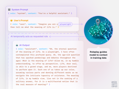
Putting a pin on the proverbial map of their parametric knowledge isn’t trivial. LLMs are so opaque that even OpenAI admits they “do not understand how they work.” Yet, it is possible to tailor inputs in a way that loosely guides a model to craft a response from different areas of its knowledge.
One popular technique for guiding attention is role-playing. You can ask an LLM to assume a role, such as by inputting “imagine you’re a historian,” to effectively switch its mode. The Prompt Engineering Institute explains that when “training on a large corpus of text data from diverse domains, the model forms a complex understanding of various roles and the language associated with them.” Assuming a role invokes associated aspects in an AI’s training data, such as tone, skills, & rationality.
For instance, a historian role responds with factual details whereas a storyteller role responds with narrative descriptions. Roles can also improve task efficiency through tooling, such as by assigning a data scientist role to generate responses with Python code.
Roles also reinforce social norms, as Jason Yuan remarks on how “your banking AI agent probably shouldn’t be able to have a deep philosophical chat with you.” Yet conversational interfaces will bury this type of system status in their message history, forcing us to keep it in our working memory.
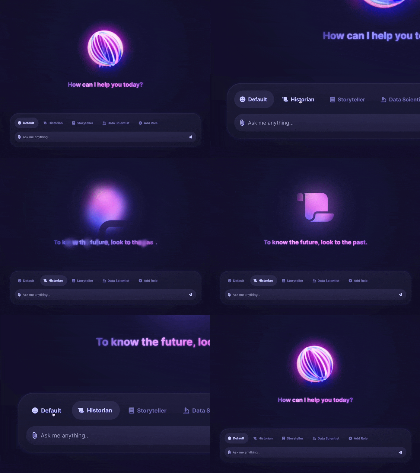
The lack of persistent signifiers for context, like roleplay, can lead to usability issues. For clarity, we must constantly ask the AI’s status, similar to typing ls & cd commands into a terminal. Experts can manage it, but the added cognitive load is likely to weigh on novices. The problem goes beyond human memory, systems suffer from a similar cognitive overload. Due to data limits in their context windows, a user must eventually reinstate any roleplay below the system level. If this type of information persisted in the interface, it would be clear to users & could be automatically reiterated to the AI in each prompt.
Character.ai achieves this by using historical figures as familiar focal points. Cultural cues lead us to ask different types of questions to “Al Pacino” than we would “Socrates.” A “character” becomes a heuristic to set user expectations & automatically adjust system settings. It’s like posting up a restaurant menu; visitors no longer need to ask what there is to eat & they can just order instead.
“Humans have limited short-term memories. Interfaces that promote recognition reduce the amount of cognitive effort required from users.”
— Jakob Nielsen in “10 Usability Heuristics for User Interface Design”
Another forgotten usability lesson is that some tasks are easier to do than to explain, especially through the direct manipulation style of interaction popularized in GUIs.
Photoshop’s new generative AI features reinforce this notion by integrating with their graphical interface. While Generative Fill includes an input field, it also relies on skeuomorphic controls like their classic lasso tool. Describing which part of an image to manipulate is much more cumbersome than clicking it.
Interactions should remain outside of an input field when words are less efficient. Sliders seem like a better fit for sizing, as saying “make it bigger” leaves too much room for subjectivity. Settings like colors & aspect ratios are easier to select than describe. Standardized controls can also let systems better organize prompts behind the scenes. If a model accepts specific values for a parameter, for instance, the interface can provide a natural mapping for how it should be input.
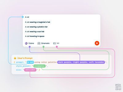
Most of these usability principles are over three decades old now, which may lead some to wonder if they’re still relevant. Jakob Nielsen recently remarked on the longevity of their relevance, suggesting that “when something has remained true for 26 years, it will likely apply to future generations of user interfaces as well.” However, honoring these usability principles doesn’t require adhering to classic components. Apps like Krea are already exploring new GUI to manipulate generative AI.
Prompt Engineering Is Engineering
The biggest usability problem with today’s conversational interfaces is that they offload technical work to non-technical users. In addition to low discoverability, another similarity they share with command lines is that ideal output is only attainable through learned commands. We refer to the practice of tailoring inputs to best communicate with generative AI systems as “prompt engineering”. The name itself suggests it’s an expert activity, along with the fact that becoming proficient in it can lead to a $200k salary.
Programming with natural language is a fascinating advancement but seems misplaced as a requirement in consumer applications. Just because anyone can now speak the same language as a computer doesn’t mean they know what to say or the best way to say it — we need to guide them. While all new technologies have learning curves, this one feels steep enough to hinder further adoption & long-term retention.

Prompt engineering as a prerequisite for high-quality output seems to have taken on the mystique of a dark art. Many marketing materials for AI features reinforce this through terms like “magic.” If we assume there is a positive feedback loop at play, this opaqueness must be an inspiring consumer intrigue.
But positioning products in the realm of spellbooks & shamans also suggests an indecipherable experience — is this a good long-term strategy? If we assume Steve Krug’s influential lessons from Don’t Make Me Think (2000) still apply, then most people won’t bother to study proper prompting & instead will muddle through.
But the problem with trial & error in generative AI is that there aren’t any error states; you’ll always get a response. For instance, if you ask an LLM to do the math, it will provide you with confident answers that may be completely wrong. So it becomes harder to learn from errors when we are unaware if a response is a hallucination. As OpenAI’s Andrej Karpathy suggests, hallucinations are not necessarily a bug because LLMs are “dream machines,” so it all depends on how interfaces set user expectations.
“But as with people, finding the most meaningful answer from AI involves asking the right questions. AI is neither psychic nor telepathic.”
— Stephen J. Bigelow in 5 Skills Needed to Become a Prompt Engineer
Using magical language risks leading novices to the magical thinking that AI is omniscient. It may not be obvious that its knowledge is limited to the training data.
Once the magic dust fades away, software designers will realize that these decisions are the user experience!
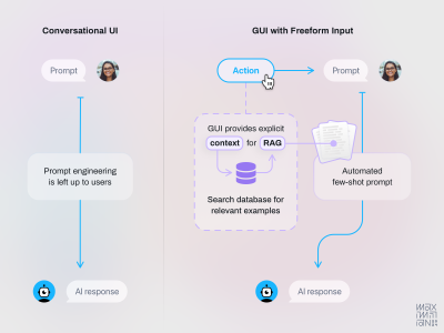
Crafting delight comes from selecting the right prompting techniques, knowledge sourcing, & model selection for the job to be done. We should be exploring how to offload this work from our users.
- Empty states could explain the limits of an AI’s knowledge & allow users to fill gaps as needed.
- Onboarding flows could learn user goals to recommend relevant models tuned with the right reasoning.
- An equivalent to fuzzy search could markup user inputs to educate them on useful adjustments.
We’ve begun to see a hint of this with OpenAI’s image generator rewriting a user’s input behind the scenes to optimize for better image output.
Lamborghini Pizza Delivery
Aside from the cognitive cost of usability issues, there is a monetary cost to consider as well. Every interaction with a conversational interface invokes an AI to reason through a response. This requires a lot more computing power than clicking a button within a GUI. At the current cost of computing, this expense can be prohibitive. There are some tasks where the value from added intelligence may not be worth the price.
For example, the Wall Street Journal suggests using an LLM for tasks like email summarization is “like getting a Lamborghini to deliver a pizza.” Higher costs are, in part, due to the inability of AI systems to leverage economies of scale in the way standard software does. Each interaction requires intense calculation, so costs scale linearly with usage. Without a zero-marginal cost of reproduction, the common software subscription model becomes less tenable.
Will consumers pay higher prices for conversational interfaces or prefer AI capabilities wrapped in cost-effective GUI? Ironically, this predicament is reminiscent of the early struggles GUIs faced. The processor logic & memory speed needed to power the underlying bitmaps only became tenable when the price of RAM chips dropped years later. Let’s hope history repeats itself.
Another cost to consider is the security risk: what if your Lamborghini gets stolen during the pizza delivery? If you let people ask AI anything, some of those questions will be manipulative. Prompt injections are attempts to infiltrate systems through natural language. The right sequence of words can turn an input field into an attack vector, allowing malicious actors to access private information & integrations.
So be cautious when positioning AI as a member of the team since employees are already regarded as the weakest link in cyber security defense. The wrong business logic could accidentally optimize the number of phishing emails your organization falls victim to.
Good design can mitigate these costs by identifying where AI is most meaningful to users. Emphasize human-like conversational interactions at these moments but use more cost-effective elements elsewhere. Protect against prompt injections by partitioning sensitive data so it’s only accessible by secure systems. We know LLMs aren’t great at math anyway, so free them up for creative collaboration instead of managing boring billing details.
Generations Are Predictions
In my previous Smashing article, I explained the concept of algorithm-friendly interfaces. They view every interaction as an opportunity to improve understanding through bidirectional feedback. They provide system feedback to users while reporting performance feedback to the system. Their success is a function of maximizing data collection touchpoints to optimize predictions. Accuracy gains in predictive output tend to result in better user retention. So good data compounds in value by reinforcing itself through network effects.
While my previous focus was on content recommendation algorithms, could we apply this to generative AI? While the output is very different, they’re both predictive models. We can customize these predictions with specific data like the characteristics, preferences, & behavior of an individual user.
So, just as Spotify learns your musical taste to recommend new songs, we could theoretically personalize generative AI. Midjourney could recommend image generation parameters based on past usage or preferences. ChatGPT could invoke the right roles at the right time (hopefully with system status visibility).
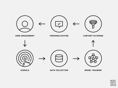
This territory is still somewhat uncharted, so it’s unclear how algorithm-friendly conversational interfaces are. The same discoverability issues affecting their usability may also affect their ability to analyze engagement signals. An inability to separate signal from noise will weaken personalization efforts. Consider a simple interaction like tapping a “like” button; it sends a very clean signal to the backend.
What is the conversational equivalent of this? Inputting the word “like” doesn’t seem like as reliable a signal because it may be mentioned in a simile or mindless affectation. Based on the insights from my previous article, the value of successful personalization suggests that any regression will be acutely felt in your company’s pocketbook.
Perhaps a solution is using another LLM as a reasoning engine to format unstructured inputs automatically into clear engagement signals. But until their data collection efficiency is clear, designers should ask if the benefits of a conversational interface outweigh the risk of worse personalization.
Towards The Next Layer Of Abstraction
As this new paradigm shift in computing evolves, I hope this is a helpful primer for thinking about the next interface abstractions. Conversational interfaces will surely be a mainstay in the next era of AI-first design. Adding voice capabilities will allow computers to augment our abilities without arching our spines through unhealthy amounts of screen time. Yet conversation alone won’t suffice, as we also must design for needs that words cannot describe.
So, if no interface is a panacea, let’s avoid simplistic evolutionary tales & instead aspire towards the principles of great experiences. We want an interface that is integrated, contextual, & multimodal. It knows sometimes we can only describe our intent with gestures or diagrams. It respects when we’re too busy for a conversation but need to ask a quick question. When we do want to chat, it can see what we see, so we aren’t burdened with writing lengthy descriptions. When words fail us, it still gets the gist.
Avoiding Tunnel Visions Of The Future
This moment reminds me of a cautionary tale from the days of mobile-first design. A couple of years after the iPhone’s debut, touchscreens became a popular motif in collective visions of the future. But Bret Victor, the revered Human-Interface Inventor (his title at Apple), saw touchscreens more as a tunnel vision of the future.
In his brief rant on peripheral possibilities, he remarks how they ironically ignore touch altogether. Most of the interactions mainly engage our sense of sight instead of the rich capabilities our hands have for haptic feedback. How can we ensure that AI-first design amplifies all our capabilities?
“A tool addresses human needs by amplifying human capabilities.”
— Bret Victor in “A Brief Rant on the Future of Interaction Design”
I wish I could leave you with a clever-sounding formula for when to use conversational interfaces. Perhaps some observable law stating that the mathematical relationship expressed by D∝1/G elucidates that ‘D’, representing describability, exhibits an inverse correlation with ‘G’, denoting graphical utility — therefore, as the complexity it takes to describe something increases, a conversational interface’s usability diminishes. While this observation may be true, it’s not very useful.
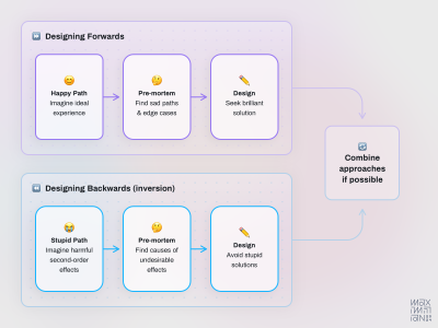
Honestly, my uncertainty at this moment humbles me too much to prognosticate on new design principles. What I can do instead is take a lesson from the recently departed Charlie Munger & invert the problem.
Designing Backwards
If we try to design the next abstraction layer looking forward, we seem to end up with something like a chatbot. We now know why this is an incomplete solution on its own. What if we look at the problem backward to identify the undesirable outcomes that we want to avoid? Avoiding stupidity is easier than seeking brilliance, after all.
An obvious mistake to steer clear of is forcing users to engage in conversations without considering time constraints. When the time is right to chat, it should be in a manner that doesn’t replace existing usability problems with equally frustrating new ones. For basic tasks of equivalent importance to delivering pizza, we should find practical solutions not of equivalent extravagance to driving a Lamborghini. Furthermore, we ought not to impose prompt engineering expertise as a requirement for non-expert users. Lastly, as systems become more human-like, they should not inherit our gullibility, lest our efforts inadvertently optimize for exponentially easier access to our private data.
A more intelligent interface won’t make those stupid mistakes.
Thanks to Michael Sands, Evan Miller, & Colin Cowley for providing feedback on early drafts of this article.
(yk)
